

I thought it'd be interesting to document how I put this blog together, although it is nothing particularly special. So here is the first installment of a dev log of sorts for this blog, to be updated later as I add more features to it (maybe). Note that everything here is my own process and is really not a guideline for best practices. It is simply what worked for me in the most convenient way, balancing between what is familiar/ easy for me, and trying to learn new things.
If you just want to see a list of resources I used, you can go here instead.
Quick Nav
🎨 Blog UI Design
This is the first step when I add any new page on this website, which is to design what it looks like. A professional would use something like Figma. I use Canva. The design doesn't need to include every detail (even the colours are off!), but I find it very helpful to have an idea of how the page should look instead of experimenting as I am coding.
Canva UI Design for Blog
📃 Blog HTML Template
After I have the rough UI designs, I just jump straight into coding the page in HTML. I add whatever CSS I need at this stage. I also used Bootstrap through a CDN, because I've used it so much I include it by default, but you don't really need to use it at all. In fact, I'm not sure if it is even advisable to use Bootstrap anymore in modern front end web development. Unfortunately, I love Bootstrap so I will continue using it.
I created one template page for the main page (with the list of posts), and one template page to be used for the individual posts. You can view the HTML templates I've made for this blog here.
I also add any Javascript I need at this point, which is only the comment widget in this case. I won't go into detail on how I set it up because the widget page itself already explains it very well, but I absolutely love it for how customisable it is!
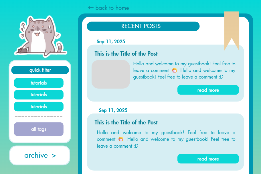
I also try to keep my page as responsive as possible. This means having to shift some UI elements like moving the "tags" and "archive" buttons on the sidebar in the desktop view to the top in the mobile view. The trick is to actually have two sets of buttons, one on the sidebar and one at the top. Then all you need to do is to hide the top buttons in desktop view and the sidebar buttons in mobile view.
Desktop view
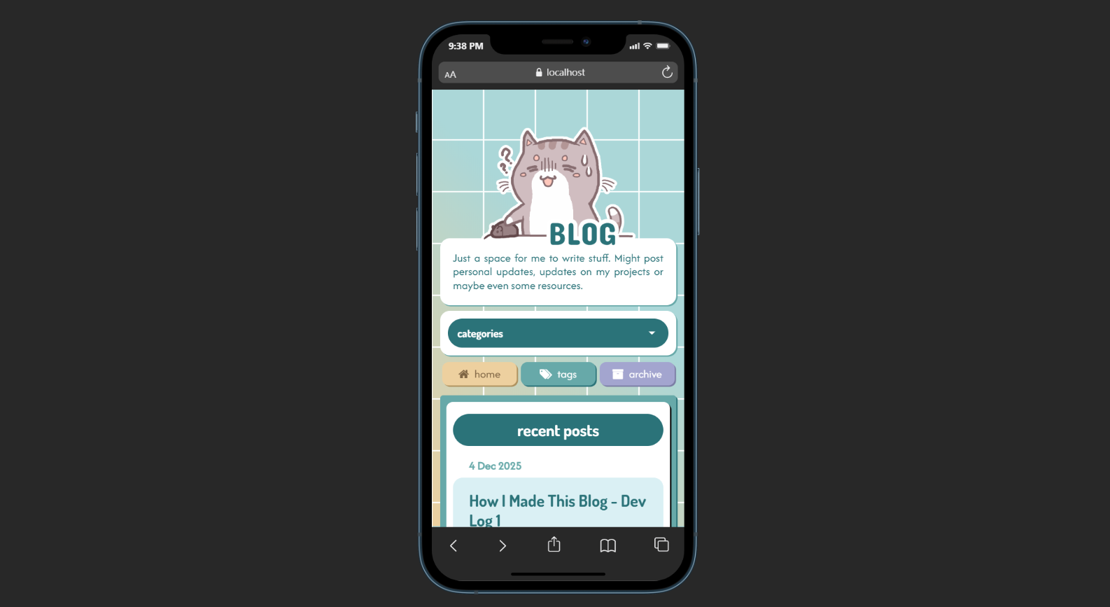
Mobile view
Again, I am not the best at responsive design. I just try to come up with something that doesn't look horrible to me.
💻 11ty-fying My Site
With the HTML templates mostly complete, I start converting them into something I can use with Eleventy, which is a static site generator and the whole reason I built this site. Anyway, because the 11ty documentation page is horrible, I followed Youtube tutorials for this part, a list of which I have compiled here.
I don't think I can offer a better explanation of what needs to be done in text than this video, so I won't go into detail for this part. But the end result is that I had some source code that 11ty could compile into static HTML pages.
You can view my source code for this blog in my Github repository.
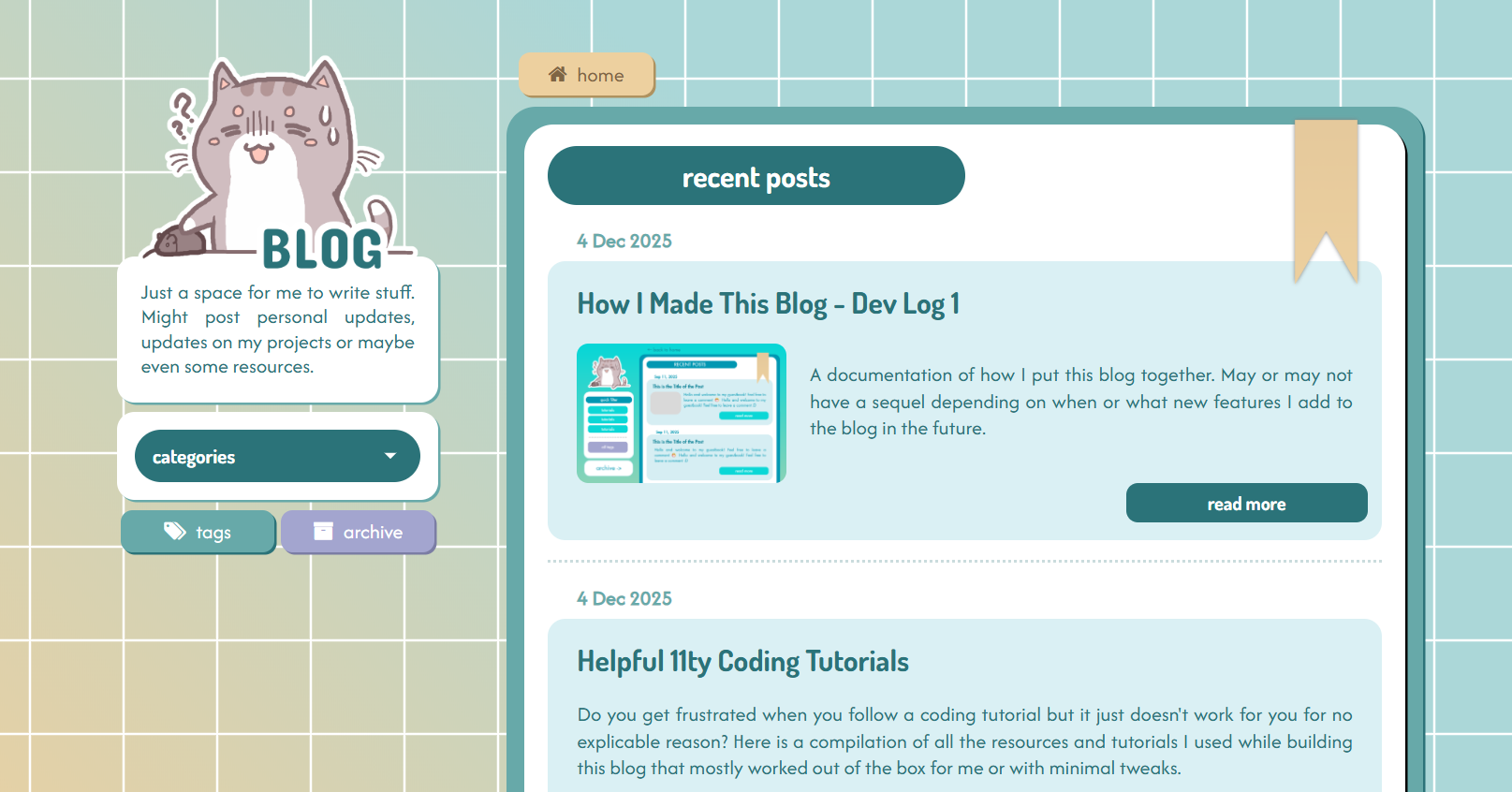
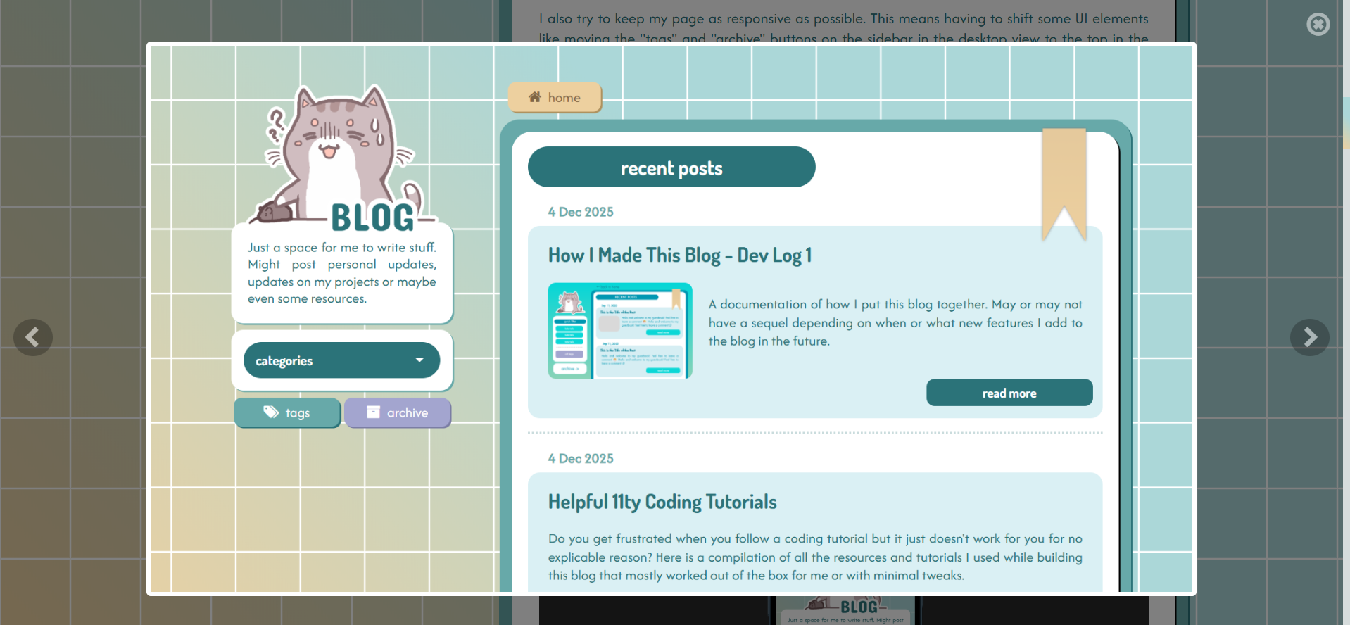
🏠 Blog Index Page
This is the landing page, which will display a preview of all posts, sorted in chronological order, with the most recent ones at the top. It has pagination as well.
📑 Posts
Every post on this blog is created by inserting content written in a Markdown file into a common template. I mean, that is just how 11ty works, so it is nothing special. Other than the content of the post itself, you can also display "meta" information, such as the post date and the post tags, which is defined in the header portion of the Markdown file (also known as the front matter).
Example for this post
---
title: How I Made This Blog - Dev Log 1
author: kanekos
date: 2025-12-05
tags: ["projects", "blog", "blog dev log"]
image: /posts/images/blog-dev-log/canva_blog.png
imageAlt: Blog UI Design
description: A documentation of how I put this blog together.
---
As you can see, these same tags are displayed at the bottom of this post.
💻 Blog Tag Pages
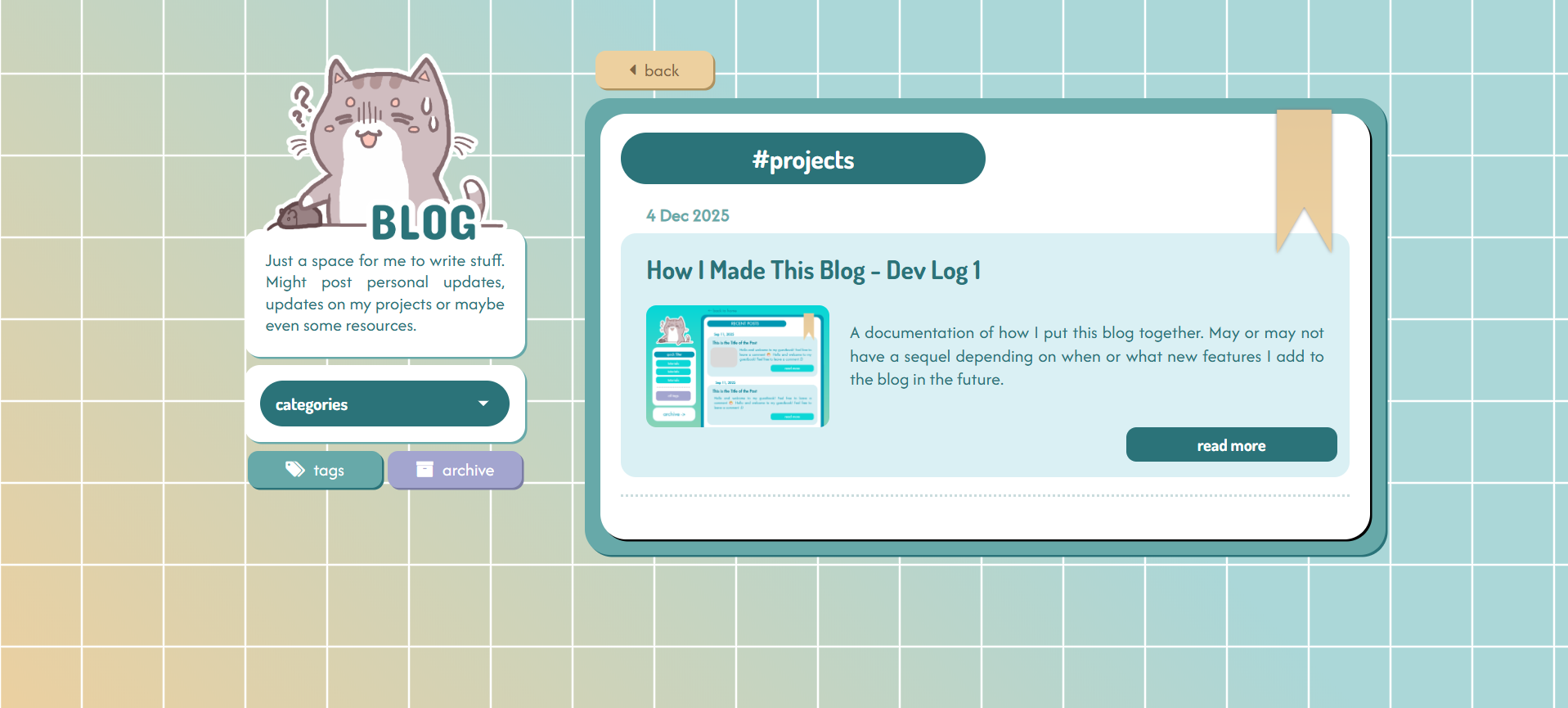
Tag Page for Projects
Every tag has its own HTML page that displays a preview of all the posts under that tag (example). This is a built-in feature of 11ty that I found to be incredibly useful, so I didn't have to go write my own custom JS tagging system.
For how to do this, you can try this tutorial here.
🏷️ Tag List Page
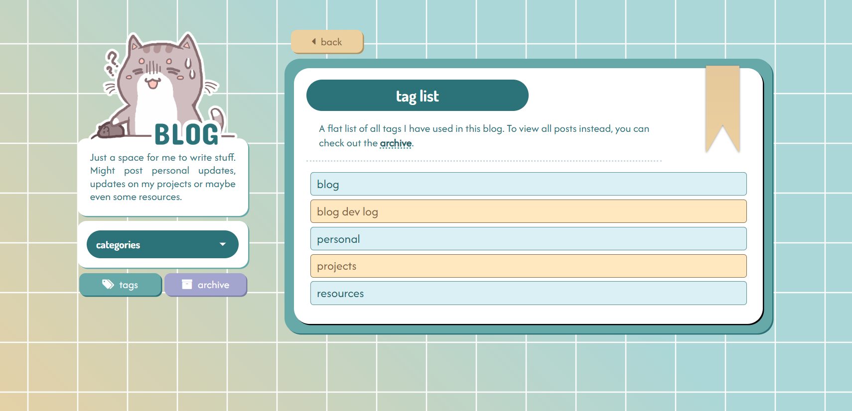
Taglist Page
This page simply displays a list of all current tags used on this blog. It is automatically updated whenever I add a new tag to a post. I don't think there is a built-in collection you can use in 11ty to get all your tags, but this custom function in the .eleventy.js config file did the trick for me:
eleventyConfig.addCollection("allTags", function (collectionApi) {
  let tagSet = new Set();
    collectionApi.getAll().forEach((item) => {
      if (Array.isArray(item.data.tags)) {
        item.data.tags.forEach((tag) => {
          if (tag !== "post") {
            tagSet.add(tag);
          }
        });
      }
    });return [...tagSet].sort();
});
(There might be a better way to do this, but I haven't found one.)
With that, I have a collection (collection.allTags) which contains all the tags I've ever used. Note that this excludes the tag "post", which I have included on every post by default.
On my taglist page, I just loop through this collection to display each tag:
View code
---
title: "Taglist"
layout: "base.njk"
---

<h1 class="blog-header mt-2 mb-3">tag list</h1>
<div class="tag-list-description">
  <p>
    A flat list of all tags I have used in this blog. To view all posts instead,
    you can check out the <a href="{{ '/archive' | url }}">archive</a>.
  </p>
</div>
<hr class="dotted-divider-80 dotted-divider" />
<div class="tag-list-container">
  {% for tag in collections.allTags %}
    <a href="{{ ('/tag/' + (tag | slug) + '/') | url }}" class="tag-list-item">
      {{ tag }}
    </a>
  {% endfor %}
</div>
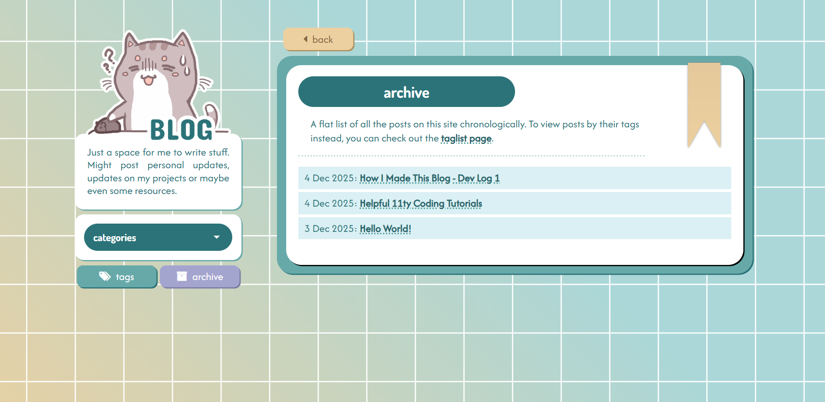
🗃️ Archive Page
Archive Page
Similar to the tag list page, this page displays all the posts ever on this site. Really it's just a flattened version of the landing page, so it is created in basically the same manner, but only displaying the date and title of each post.
🔢 Pagination
I've created a separate post about how I've implemented the pagination on this blog in Javascript. You can check it out here!
🚫 Fixing Broken Links
The biggest problem I faced when I started to use 11ty was that I had no idea how to handle links. After I got the generated HTML files and dumped them on Neocities, all the links, including those to my CSS and Javascript files, were just completely broken. When I tried to search up this issue online, there didn't seem to be any straightforward answer to this problem either.
This issue seemed to be that I was deploying my blog under kanekos.neocities.org/blog/, instead of simply kanekos.neocities.org/ — because I keep all of the files related to this blog in their own folder, instead of the root directory.
So this has seemed to work for me:
I added a path prefix in the .eleventy.js config file.
return {
dir: {
input: "src",
output: "public/blog",
},
pathPrefix: "/blog/",
};
I also updated all URLs to this format:
<link rel="stylesheet" type="text/css" href="{{ '/styles/main.css' | url }}"/>
<script src="{{ '/scripts/pagination.js' | url }}"></script>
<a class="filter-item" href="{{ '/tag/resources' | url }}"> resources</a>
By appending | url at the end of every link, 11ty will convert the URLs to include the prefix you defined. For example, in my case, this would be /blog/ - so the URL in the generated HTML page will be /blog/styles/main.css
If you have encountered a similar issue, feel free to let me know how you have resolved it, as I am still not certain if this is the correct approach.
🛠️ Markdown
All of the posts on this site are written in Markdown language, which I've used to write Github README.md files before, but didn't realise how flexible it was until now.
One problem I thought I would have with writing posts in Markdown that I planned to add images to my posts, and I didn't know how I could style them in Markdown. However, I have since learnt that you can add HTML directly in Markdown, and that immediately made this super simple, since I can just add the image, you know, in HTML.
Also, if I wanted to add some special styling for any particular text, I can simply add an HTML tag around it, assign a class to it, and then style it in CSS.
Like this
Technically inline CSS should work perfectly fine as well.
On the other hand, if you want to apply changes across all posts - e.g. change the colour of all links in posts - then simply finding the right element to target in CSS will be sufficient.
For example, I used the CSS selector .post-body pre to apply styling to all code blocks in this post:
🖼️ Image Handling
So it's great that I can add images in Markdown files using HTML, but that meant that every time I wanted to add an image, I had to include this chunk of code. Not fun, right?
<div class="post-body-img-container">
    <img src="/blog/posts/images/Ailthir_Chibi.png" class="post-body-img" />
    <p class="post-img-caption">image caption</p>
</div>
Instead of having to copy and paste this chunk around every time, I created what is known as a shortcode in 11ty, which is basically a way to create a shortened version of that code block.
So now, all I have to add in the Markdown file itself is this:
{% imgBlock "/posts/images/Ailthir_Chibi.png", "image caption" %}
Which will give me the exact same rendered HTML output as the code block above.
To achieve this, I just needed to include this function in the .eleventy.js config file:
eleventyConfig.addShortcode("imgBlock", function (src, caption) {
    const url = eleventyConfig.getFilter("url")(src);
    return `
      <div class="post-body-img-container">
        <img src="${url}" class="post-body-img-l"
        />
        <p class="post-img-caption">${caption}</p>
      </div>
    `;
});
Great! But some of the images look a little too small in the post. What if you could click on them to view a larger version display in a lightbox?
Image Modal
You could probably achieve this with some JS library like LightBox2, but since I'm using Bootstrap already, I prefer to use their built-in modal.
I can recycle the same modal I'm using in my art gallery page for this.
First, I create a new .njk file containing the HTML code for my modal, naming it something like image-modal.njk:
View code
<!-- Modal -->
<div
  class="modal fade"
  id="galleryModal"
  tabindex="-1"
  aria-labelledby="galleryModalLabel"
>
  <i
    class="fa fa-times-circle-o modal-cross"
    aria-hidden="true"
    data-bs-dismiss="modal"
    aria-label="Close"
  ></i>
  <div class="modal-nav-container">
    <i
      class="fa fa-chevron-left modal-arrow modal-arrow-left"
      aria-hidden="true"
      onclick="showNextOrPrevImg(-1);"
    ></i>
  </div>
  <div class="modal-dialog modal-dialog-centered">
    <div class="modal-content">
      <div class="d-flex flex-row justify-content-center modal-row">
        <div class="modal-image-container">
          <img src="" class="modal-image img-fluid" id="modal-image" />
        </div>
      </div>
    </div>
  </div>
  <div class="modal-nav-container">
    <i
      class="fa fa-chevron-right modal-arrow modal-arrow-right"
      aria-hidden="true"
      onclick="showNextOrPrevImg(1);"
    ></i>
  </div>
</div>
I include image-modal.njk right before the end of the body tag in my base template (base.njk), since I want this modal to be there for every post.
Then I make a few changes to my Eleventy shortcode:
eleventyConfig.addShortcode("imgBlock", function (src, caption) {
    const url = eleventyConfig.getFilter("url")(src);
    return `
      <div class="post-body-img-container">
        <img src="${url}" class="post-body-img-l"
          onclick="showImage(this);"
          data-bs-toggle="modal"
          data-bs-target="#galleryModal"
        />
        <p class="post-img-caption">${caption}</p>
      </div>
    `;
});
data-bs-toggle and data-bs-target allow the modal to be displayed when the user clicks on the image, where data-bs-target should correspond to the id of your modal.
showImage(this) is a custom JS function to make the modal display the image the user has clicked on. I'll define this function in my Javascript file:
View code
const modalImg = document.getElementById("modal-image");
function showImage(image) {
  console.log("Clicked show image!");
  console.log(image);

  modalImg.style.display = "none";
  modalImg.src = image.src;

  modalImg.onload = function () {
    modalImg.style.display = "block";
  };
}
This image should display in a modal - modal-ception!
If you want something even more extra, you can add left and right navigation buttons to the modal. The HTML code I've shared for my modal includes them by default. All you have to do is to include this function in your Javascript file - showNextOrPrevImg()
View code
function showNextOrPrevImg(direction) {
  const visibleImages = Array.from(
    document.querySelectorAll(".YOUR_CLASS_NAME")
  );
  const currentSrc = modalImg.src;
  let currentIndex = visibleImages.findIndex((img) => img.src === currentSrc);
  let nextIndex = currentIndex + direction;
  if (direction === 1 && nextIndex >= visibleImages.length) {
    nextIndex = 0;
  } else if (direction === -1 && nextIndex === -1) {
    nextIndex = visibleImages.length - 1;
  }
  showImage(visibleImages[nextIndex]);
}
Note: Replace YOUR_CLASS_NAME with a class that all your clickable images should have in common.
You can use this image modal in regular HTML pages as well, no 11ty is required, only Bootstrap. I can make a separate post on this in the future, once I've cleaned up my code.
🌟 Future Plans
For my own reference, here is a to-do list of features I plan to add to this blog in the near future:
- Microblog - this will be a list of my status.cafe statuses, probably extracted using the Surfing Waves RSS widget
- More image styling options in posts, maybe even an image gallery or carousel?
- A way to filter or list posts by date
And that is all for this post which covers the basic features that I've implemented in this blog! There will be another entry to this dev log only if/ when I add new features to this blog.